Introduction to eTOM

eTOM is the telecommunications industry’s business process framework standard. In this “eTOM 101” article, we’ll cover the key things you need to know about eTOM:

  1. The definition and purpose of eTOM
  2. The evolution of eTOM, including Classic eTOM and Modern eTOM
  3. The structure of Modern eTOM
  4. The content of eTOM
  5. eTOM process decompositions
  6. How to use eTOM
  7. If you want to go beyond, find out about the “201” presentation on eTOM Flows.

To get things started, here is a 1-page snapshot of a recent version of eTOM, which you can click to view larger.

etom-15.5c.png

eTOM Process Flows, Not Just Hierarchies

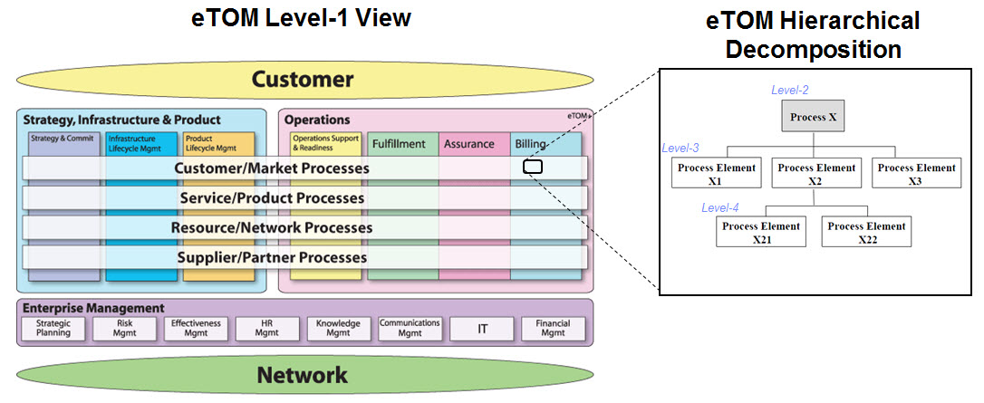
eTOM (enhanced Telecom Operations Map) is the telecommunications industry’s standard business process framework. It sounds paradoxical, but the eTOM framework does not contain process flows itself. eTOM gives you the building blocks with which to build a process flow, but these building blocks are organized by parent-child process hierarchy. To connect with business people, you do need to have the flows!

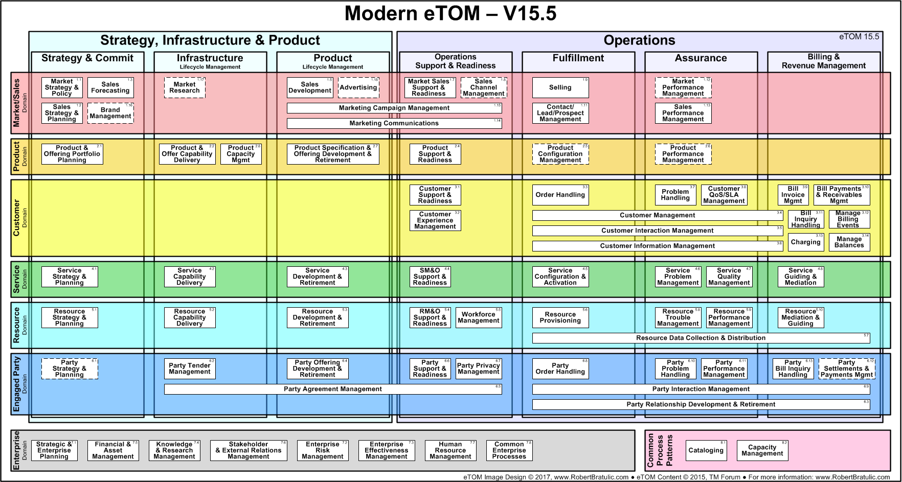
In the diagram below, you see a typical eTOM process pattern on the right, a process hierarchical decomposition, which happens to reside in the Billing vertical and the Customer Management row. It could for example be “Bill Invoice Management”, and its sub-tasks, Pricing and Discounting, and their sub-tasks, and so on.

etom-hierarchy-wordpress

eTOM is organized as this two-dimensional grid housing hundreds of such hierarchical process decompositions, i.e. “tree diagrams” – which is great for classifying “what” a process does into categories and sub-categories — but eTOM does not spell out any actual process flows, i.e. “blocks and arrows” – which people look for to understand “how” a process actually unfolds over time.

Latest TMForum Business Metrics Scorecard Poster Available

Earlier this month at TMForum Live! in Nice, the latest iteration of the Business Metrics Scorecard (BMS) poster was released: BUSINESS METRICS R15

metrics-poster.png

The poster does a nice job of laying out about 100 metrics, roughly in three regions, suggestive of how you might lay out an actual balanced scorecard. By “balanced”, we mean that we are balancing the financial, customer, and process perspectives. (And some would add an employee perspective as well.)

  • The Strategy & Commit section on top (formerly called Revenue & Margin, a better name frankly) has high-level financial metrics, like ARPU and Profitability. There are also numerous metrics on Revenue Assurance.
  • The Customer Experience section below it includes metrics like Average Hold Time and First Call Resolution.
  • The Operational Efficiency section is full of metrics related to the cost, time and quality of handling transactional artifacts like orders, trouble tickets, bills, etc.

There is a lot more depth to these metrics (definitions, formulas, categorizations, etc.), available in a series of documents online (GB935) available to members.